Animating Strava heatmaps
Published:
Rexamining my Strava data
Last year, I downloaded my Strava running data for the first time and did some simple analyses and visualizations. As I was following a formal marathon training schedule during 2020, the data was relatively nicely structured and there were some fun patterns to see.
Since then however, the more interesting aspect of my running is that I have been living and working remotely in a variety of places. I’ve always found geospatial visualizations to be super interesting, and although Strava has a built in heatmap of your routes, it is only available to premium users (which I am not). But as I’ve been moving to new places and gradually exploring via running, I also was interested in visualizing the progression of my routes over time. So, I decided to once again download my Strava data but this time write some code to plot static and animated heatmaps of my routes in the main locations I have been living in. The code is accessible on my github and runable from the command line for any others interested in downloading their data and generating similar visualizations!
My explorations
Here I highlight the evolution of my running routes in the four main places I’ve lived since I started using Strava back in early 2020.
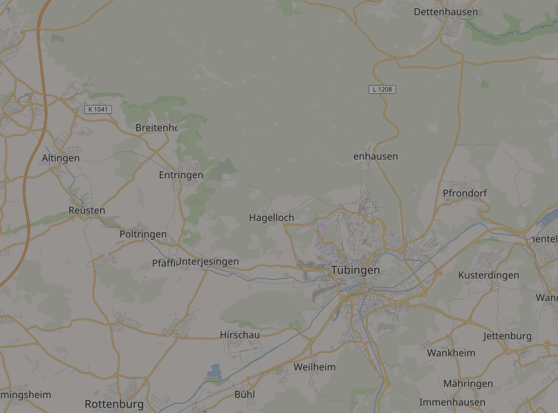
Tuebingen
The Tuebingen map is unique in that it really does capture every single run I’ve done. I had done at least a couple of runs in the other cities before starting to use Strava.
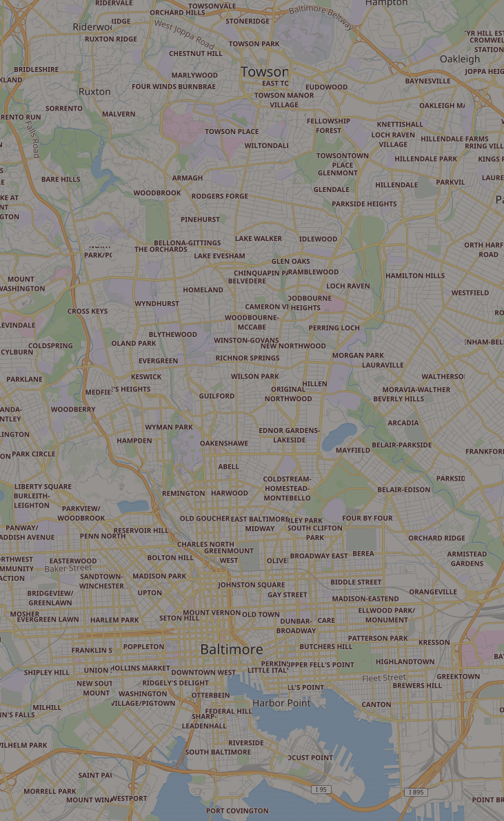
Baltimore
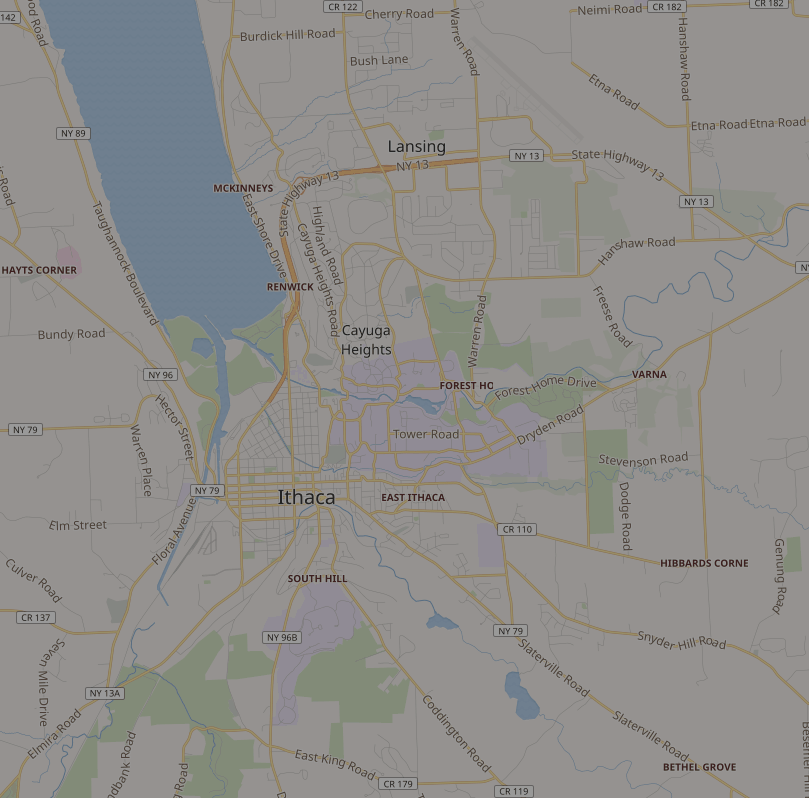
Ithaca
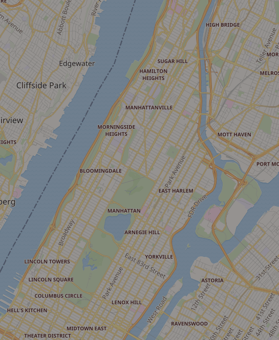
NYC (well, really just Manhattan)